1
2
3
4
5
6
7
8
9
10
11
12
13
14
15
16
17
18
19
20
21
22
23
24
25
26
27
28
29
30
31
32
33
34
35
36
37
38
39
40
41
42
|
import React, { Component } from 'react'
import { Icon } from 'antd';
export default class CloudConnected extends Component {
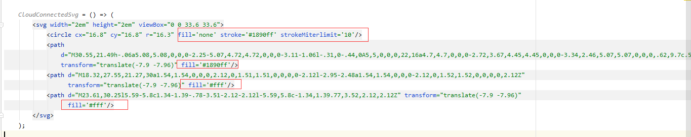
CloudConnectedSvg = () => (
<svg width="2em" height="2em" viewBox="0 0 33.6 33.6">
<circle cx="16.8" cy="16.8" r="16.3" fill='none' stroke='#1890ff' strokeMiterlimit='10'/>
<path
d="M30.55,21.49h-.06a5.08,5.08,0,0,0-2.25-5.07,4.72,4.72,0,0,0-3.11-1.06l-.31,0-.44,0A5,5,0,0,0,22,16a4.7,4.7,0,0,0-2.72,3.67,4.45,4.45,0,0,0-3.34,2.46,5.07,5.07,0,0,0,.62,9.7c.53.13,1.33.35,1.66.42a26.42,26.42,0,0,0,2.82.42,28.92,28.92,0,0,0,4.29.25,20.69,20.69,0,0,0,4.09-.58,4.63,4.63,0,0,0,1.5-.45,4.12,4.12,0,0,0,.74-.45C37,30.33,36.61,21.49,30.55,21.49Z"
transform="translate(-7.9 -7.96)" fill='#1890ff'/>
<path d="M18.32,27.55,21.27,30a1.54,1.54,0,0,0,2.12,0,1.51,1.51,0,0,0,0-2.12l-2.95-2.48a1.54,1.54,0,0,0-2.12,0,1.52,1.52,0,0,0,0,2.12Z"
transform="translate(-7.9 -7.96)" fill='#fff'/>
<path d="M23.61,30.25l5.59-5.8c1.34-1.39-.78-3.51-2.12-2.12l-5.59,5.8c-1.34,1.39.77,3.52,2.12,2.12Z" transform="translate(-7.9 -7.96)"
fill='#fff'/>
</svg>
);
HeartSvg = () => (
<svg width="1em" height="1em" fill="currentColor" viewBox="0 0 1024 1024">
<path
d="M923 283.6c-13.4-31.1-32.6-58.9-56.9-82.8-24.3-23.8-52.5-42.4-84-55.5-32.5-13.5-66.9-20.3-102.4-20.3-49.3 0-97.4 13.5-139.2 39-10 6.1-19.5 12.8-28.5 20.1-9-7.3-18.5-14-28.5-20.1-41.8-25.5-89.9-39-139.2-39-35.5 0-69.9 6.8-102.4 20.3-31.4 13-59.7 31.7-84 55.5-24.4 23.9-43.5 51.7-56.9 82.8-13.9 32.3-21 66.6-21 101.9 0 33.3 6.8 68 20.3 103.3 11.3 29.5 27.5 60.1 48.2 91 32.8 48.9 77.9 99.9 133.9 151.6 92.8 85.7 184.7 144.9 188.6 147.3l23.7 15.2c10.5 6.7 24 6.7 34.5 0l23.7-15.2c3.9-2.5 95.7-61.6 188.6-147.3 56-51.7 101.1-102.7 133.9-151.6 20.7-30.9 37-61.5 48.2-91 13.5-35.3 20.3-70 20.3-103.3 0.1-35.3-7-69.6-20.9-101.9z"/>
</svg>
);
render() {
const CloudConnectedIcon = props =>
<Icon component={() => <this.CloudConnectedSvg/>} {...props} />;
const HeartIcon = props => <Icon component={this.HeartSvg} {...props} />;
return (
<div>
<HeartIcon style={{ color: 'hotpink' }}/>
<CloudConnectedIcon/>
</div>
)
}
}
|